

Chart of the World’s Cities Puts Zurich on Top and Porto in the Sweet Spot
• From trending topic: Chart Maps Cities by Cost of Living and Quality of Life
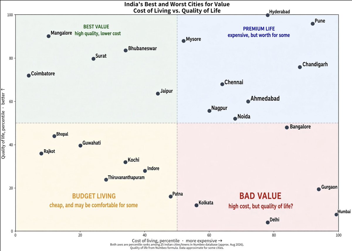
Summary
A scatterplot built from Numbeo’s August 2026 cost-of-living and quality-of-life indices has been spreading quickly on X, sorting major cities into familiar quadrants. Zurich and Amsterdam sit in the high-cost, high-quality cluster that users immediately labeled premium. Porto and Tallinn land in the opposite corner: lower cost, still-strong quality-of-life scores, the spot many are calling best value.
One popular recreation flipped the axes so the upper-right corner read as unambiguously best. Its author said the quality-of-life side of the Numbeo data includes whether people actually like living there, along with climate and healthcare. A second widely liked post stressed that the axes are percentiles, not raw percentages, that Hyderabad and Mumbai appear at the 100th percentile on both measures in that version, and that any individual’s experience can diverge from the averages. A third post, simpler and even more popular, simply declared that nothing beats Zurich.
The chart itself is not new methodology; Numbeo has published these indices for years. What is new is the particular August 2026 snapshot and the speed with which people began remaking, annotating, and arguing over the picture.
Common Perspectives
Premium is worth the premium
Residents and admirers of the most expensive, highest-scoring cities treat the plot as validation. They see Zurich’s position as evidence that the extra cost buys measurably better safety, healthcare, and daily functioning, and they are unmoved by cheaper alternatives. This view is common among internationally mobile professionals and high earners who already live in or can reach those cities. It assumes quality of life is sufficiently objective and portable that paying more is the rational move if you can. The trade-off is that the same cities become unreachable for most people, including many of their own younger workers.
Arithmetic over prestige
A second group looks at Porto, Tallinn and similar cities and sees the smarter choice. Comparable quality of life at far lower cost means less financial pressure and more leftover income. The argument appeals to remote workers, younger professionals, and anyone who has watched housing in “global” cities detach from ordinary wages. It rests on the belief that the lived gap between Zurich and a well-scoring cheaper city is smaller than the index implies, or that the money saved more than closes it. The risk is that the “best-value” label itself can attract enough newcomers to erase the value.
Useful map, not a verdict
Others treat the chart as a conversation starter rather than a ranking to obey. They point to the percentile framing, the subjective ingredients inside quality of life, and the explicit reminder that personal perception varies. Some dwell on outliers such as the Indian cities placed at the extreme of both axes. These readers tend to live outside the usual Western shortlist or simply distrust crowd-sourced indices as complete pictures. They enjoy the comparison but refuse to let two numbers decide a move. The cost is messier, more personal decision-making; the assumption they reject is that a two-axis plot can settle where a life should be lived.
The picture is the argument
A smaller but highly engaged set of users is less interested in any particular city than in how the data are shown. Flipping the axes so “best” occupies the familiar top-right quadrant is offered as an improvement in clarity. This perspective comes from people who like ranking culture and data visualization. It assumes that once the numbers are fixed, presentation is mostly neutral. In practice the choice of which corner looks like winning quietly ranks the cities before anyone reads a label.
A Different View
The entire discussion treats cities as items on a menu that digitally connected people can simply select. Most residents cannot. Citizenship, language, family, visas, and the fact of already having a life in one place constrain the choice far more tightly than any index. The chart’s popularity may therefore say less about imminent relocation than about a particular class’s habit of viewing the planet as a set of consumer options. At the same time, the cities that score well on value may discover that virality itself becomes a cost: remote workers and visitors arrive and begin bidding up the affordability that made the place attractive in the first place.
Conclusion
The next useful signal will not be another recreation of the same plot, but housing and migration numbers from the cities now labeled bargains, and whether the August 2026 snapshot still looks the same when Numbeo updates again.
Sources and discussion
These public posts were collected while researching this story. They provide context and reactions, but may not independently verify every claim.
View the original topic on X@levelsio
@levelsio
I liked this chart so much I had to recreate it I flipped the axis so that top right is best (tip by @marckohlbrugge and @daniellockyer) My chart is based on data, which for quality of life includes people actually liking the place, climate, healthcare,
Aug 16, 20262.1K likes96 repostsAravind
@aravind
Which city will you choose? Note: - The X and Y axes are percentile, not percent. - Hyd & Mum are 100th percentile for QoL & CoL. - QoL takes into account work opportunities, healthcare quality, also. Not based only on infra or cleanliness. - Your individual perception can vary.
Aug 17, 20262.3K likes230 repostsThierry from arvy 🇨🇭
@ThierryBorgeat
Nothing—and I mean nothing—beats Zurich.
Aug 15, 202613.2K likes1K reposts